Previously the graphics used made the brand look slightly amateur and juvenile even though it is clearly a product for adults.

Personally i think it's the choice of font, it seems asif it was a school project for a 15 year olds graphics class.
The new graphics are a lot more sophisticated and it actually looks like a real, serious brand.
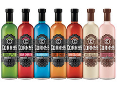
There also seems to be a lot more thought put into the decoration - you want to take a closer look at the bottle - something which rarely happens with a bottle of alcohol i'm sure!
This rebranding will definitely do a lot of good for the product - appeals to a much broader audience, not just students!
This rebranding will definitely do a lot of good for the product - appeals to a much broader audience, not just students!
No comments:
Post a Comment